The Housing Design Standards for Accessibility and Inclusion equip designers, builders, and developers with guidelines and frameworks for disability-forward housing creation. It highlights cross-disability accessibility and design decisions that are anchored in inclusion. Each month we feature one of our partners and the Element they’re most excited about.
Louisa Bukiet | Housing Development Manager | The Kelsey

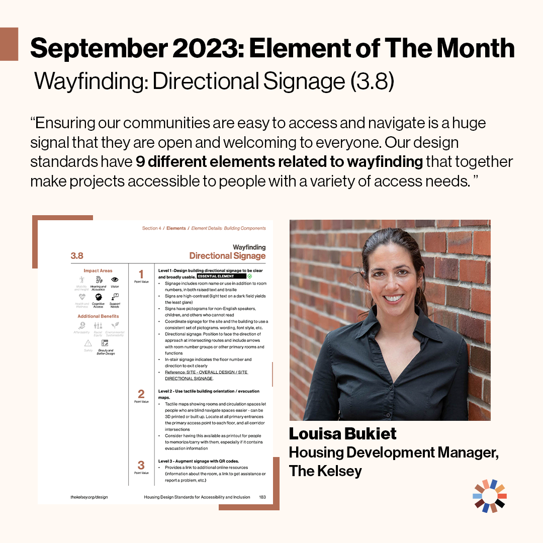
We are excited to welcome Lousia Bukiet, Housing Development Manager, to our small but mighty team at The Kelsey! She comes to us from consulting in development and design for a range of proptech, development, and design organizations. She chose the straight-forward yet critically important element of Wayfinding: Directional Signage. Louisa connects this series of wayfinding signage to residents and guests feeling welcome, comfortable and sure of where they are headed. Her background with architecture makes her appreciate design decisions geared toward accessibility and inclusivity of all people. She advises design teams to “pay careful attention to design decisions that affect the navigability of your spaces.” Ultimately she believes that “these are the kinds of decisions that thoughtful designers can use to make a huge difference in the building’s feeling of community.”
Disability-Forward Element (#): Wayfinding: Directional Signage (3.8 – but actually all the Wayfinding ones!)
Description:
Level 1 - Design building directional signage to be clear and broadly usable *Essential Element*
- Signage includes room name or use in addition to room numbers, in both raised text and braille
- Signs are high-contrast (light text on a dark field yields the least glare)
- Signs have pictograms for non-English speakers, children, and others who cannot read
- Coordinate signage for the site and the building to use a consistent set of pictograms, wording, font style, etc.
- Directional signage: Position to face the direction of approach at intersecting routes and include arrows with room number groups or other primary rooms and functions
- In-stair signage indicates the floor number and direction to exit clearly
Level 2 - Use tactile building orientation / evacuation maps.
- Tactile maps showing rooms and circulation spaces let people who are blind navigate spaces easier – can be 3D printed or built up. Locate at all primary entrances, the primary access point to each floor, and all corridor intersections
- Consider having this available as printout for people to memorize/carry with them, especially if it contains evacuation information
Level 3 - Augment signage with QR codes.
- Provides a link to additional online resources (information about the room, a link to get assistance or report a problem, etc.)
Design Category: Building Components
Impact Area(s): Hearing & Acoustics; Vision; Cognitive Access; Support Needs
Additional Benefit(s): Beauty and Better Design
Why is this element important to you, personally or for the project?
Ensuring our communities are easy to access and navigate is a huge signal that they are open and welcoming to everyone. Our design standards have 9 different elements related to wayfinding that together make projects accessible to people with a variety of access needs. Each element is an actionable design decision that addresses different access needs, paying attention to acoustics, physical navigation, cognitive needs, different native languages, and lighting to make spaces easy to understand and feel welcoming.
How would you explain this element to a 2nd grader?
These design features make it easier to find your way around the building. This is not only a benefit to residents, but also family, friends and other guests.
How did this accessibility element change (for the better) the overall project?
Wayfinding design decisions aren’t showy or flashy and residents in the space may not think about them daily but they have a constant impact on making people feel comfortable and welcome in the space. As a designer I think about how small decisions can make the space welcoming or isolating – providing the tools for people to navigate their home and community shows them they are a valued part of it.
What recommendations would you make to someone designing a disability-forward housing project (related to the design standards)?
Pay careful attention to design decisions that affect the navigability of your spaces. Feeling disoriented or ending up in the wrong place can lead to feelings of isolation and separateness. These are the kinds of decisions that thoughtful designers can use to make a huge difference in the building’s feeling of community.
